Powered By Blogger

Sunday, 23 October 2016

painting in fine ART ideas and thoughts (f/a)

Brief states , A painters eye will include knowledge and understanding in the practices exploring the physical properties of different painting media and materials.

key words included so far : experimentation, evaluation, physical, various, investigate, understanding, innovative....All these words seem to be doing or action words that have a sense of energy.

Scenario - RSA are calling for entries for its new contemporaries exhibtion - A Painters Eye - work will showcase students work that MUST REFLECT THE RELEVANCE OF PAINTING IN TODAY'S TECHNOLOGICALLY ENHANCED SOCIETY...

KEY WORDS AGAIN - relevance , today, society, technology.   these works are more fact words.....

Here the word relevance and its connection of the digital age we are now in is important. Our work can be videoed and shot to show the progression of work and how it was created. With everything available at a flick of a switch or swipe of a thumb. Competition from many more artists. Everything is so much quicker today compared to the more traditional ways of painting and we are all also guilty of expecting it that way......
Buying, showing and displaying our work has changed so much in the last ten years never mind the last century. The way we view the world and share our moments through social media, our private family moments or thoughts and feelings shared in just a click, gone out to the world wide web. (this blog another great example of how marking tests have changed)........

THEMES - Worn and Weathered or Behind the Scenes

They want to see work that demonstrates an innovative and fresh approach to the media of painting! One painting or a series of paintings. Plus an oral presentation to a selected audience.


  • Things I could consider for this are : review of notes on artist talks we've had in class (what worked best and approach to knowledge in given topic). 
  • Who is it aimed at?
  • Is it getting the intended message across enough to provoke a thought or connection
  • Colour meaning and choice?
  • Processes and considered composition
  • Medium and what does it say
  • How did my idea evolve and what was involved
I'm also to look at artists that interest me in both idea and media on moodle site. Will do this next and see how my ideas change along the way!

Things I have mind mapped this far

 BEHIND THE SCENE

  • cracks in my phone - BROKEN COMMUNICATION
  • internet dating story and clown behind the computer screen (Italian)
  • the blog I haven't published that included some feeling and heated opinions of people, fears and diary........personal and days of panic attacks but one of identity/seeing
  •   trust in the unknown - either computer cookie accepting and apps
  • welcome to the stage - the other me.....light at the end of the tunnel - happiness and growth -excitement and bringing this in an energetic piece
WORN AND WEATHERED


  • The Autumn leaves and colours
  • Old church in gala that was going to get demolished due to it being unsafe
  • still life of gadgets like old fashion telephones - mobiles - cameras etc
  • My Grandad at 90
  • Abstract colour theory of how exhausted I feel (ha)
Hopefully this will help me evaluate my thought process and see what works and doesn't. I do tend to drift and jump from one idea to the next without direction .

Degas - ballet images coming to mind but think that just because 1, I do like them 2, behind the scene being theatrical.......... and photographer Kevin Greenfield saying that he sometimes had to blend into the background to get the right natural shot of people etc






Monday, 17 October 2016

Baskerville 1706 - 1775


 Image result for john baskerville poster

John Baskerville    

Born in Wolverley Worcestershire, John Baskerville was a successful and talented young man with however, little success in his own lifetime. This is a little about the man who is not only  considered a great name in type history but who also a man that changed the way of typography with his sytlised new letter form. 

 Moving to Birmingham in 1725, Baskerville worked as a Japanner (someone who made objects with decorative lacquer) and as an engraver of headstones. He also sidelined as a teacher and writing master. Following financial success of that venture he went on and set up a type foundry in 1750.


Baskerville had said he had always had a passion for the letter foundry and after all his workings and ventures, there is no one which I have pursed with so much pleasure and steadiness. I became insensibly desirous of contributing to the perfection of them.

He experimented with paper-making, ink manufacturing, type founding and printing, producing his first typeface in about 1754. After considerable period of experimentation in production processes, his first book Virgil appeared in 1757. This was followed by some fifty other classics.

In 1758 he became printer to the Cambridge University Press for which, in 1763, he published his masterpiece. His greatest work was a folio edition of the Bible, which represented a monumental advance upon the standards and practices of the time.


Things to consider with this design font……

·         Fine vertical lines mend the metal could wear out and break more often. Recasting with the original moulds would be needed.
·         Intention, many people did not like the new typeface as felt it unreadable on the eyes. Maybe because of the intense black ink against the brilliant white paper he used

This criticism came about because of the initiative way Baskerville had made changes to the ink consistency, adhesion and clarity that could be achieved with the new laid type of paper. This new type of paper was called wove and Baskerville had first used this on his book Virgil. (basicially a smooth paper)


Characteristics of Baskerville


Well balanced, delicate, tasteful, tradition, English, folksy, authorised.

Q UPPERCASE – tail extends well beyond its body width. Seldom seen beyond calligraphy.

The lowercase g is also a classic with its curled ear and its lower bowl left unclosed.
In words like Queen and Quest the tail almost underlines the u.

Baskerville is now classified as a transitional typeface, this is because the thiner serifs and the higher contrast between serifs.

The names Baskerville assigned to the types referred to their sizes, Great Primer, Double Pica Roman Capitals, Brevier Number 1 Roman ad Two-line Double Pica Italic Capitals.


Inspirational to Baskerville – Charles Nicolas COCHIN 1715 -1790 greatest influence to illustrative art in France, by age 22yrs was an accomplished artist and engraver. Also exceeded anything that could be attempted by type founders at his time. 

Inspired by Baskerville – Joseph Fry 1728 – 1787 both had been successful in other fields and from Birmingham. Then when on to type founding.

William Martin (bulmer) – brother of Robert who was Baskerville’s foreman, and had also trained under Baskerville.

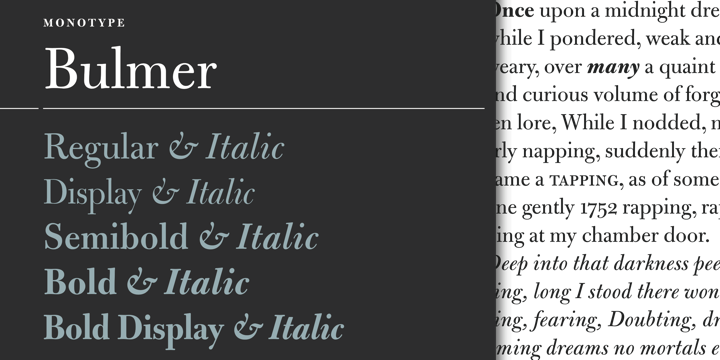
BULMER bulmer Bulmer

Image result for bulmer font shakespeare

If reading or looking close, I cant really tell much different between the two. I cant get bulmer in my list of fonts so could only use a picture of it.

 Maybe one to overlap later down the line andlook into…..    many  in the text picture above looks different I guess….The m’s ascender looks longer and the y’s tail. Doubting (the word above) looks taller while in italics, notice the b, and the i. Will test this out in my sketch book.


In the United States, around 1950, Baskerville was a favourite font and a lot of typefaces revived again with a great variety on offer.

 However, Baskerville really outdone itself by being only one of five initial typeface choices available on the Apple IPad iBook’s reading devices in April 2010.

Things for me to look into – Paper – uniform surface and watermarks? Why were binding and marketing to consider?


Transitional typefaces are a mix between Old Style and Modern typefaces. Examples include Baskerville, Georgia, and Times New Roman. The axis of symmetry is vertical as seen in the image below.


Image result for transitional typography

 Image result for transitional typography

I used word to write this in baskerville old and copied onto blogger. I do hope this reads correct. I also looked at sources mainly from books and this site to double check my findings http://www.jquarter.org.uk/webdisk/morejbask.htm

I'm trying to read paragraphs and take notes, from the notes then trying to make sentences that I understand. To then write a report from notes, memory and visualising the story or text I've read. I feel this could help me find my own way of remembering and taking in information more efficiently.

I do tend to write lots of notes in artist talks but struggle to understand them once home. By practicing note writing I hope to get a better way of working to benefit myself.


Wednesday, 12 October 2016

h/w cubism and related ism's

Cubism and related ism's.......

As I've done some looking into Cubism last year, I've decided to give a different look at influences that Cubism changed and how it brought a new way of viewing not only art but the work around us.

Paul Cezanne Father of Cubism

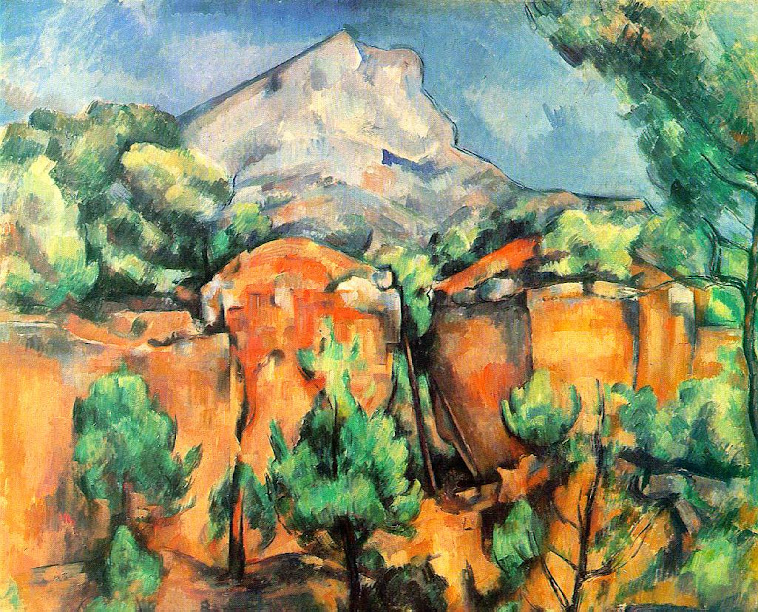
Paul Cézanne, 'Montagne Sainte Victoire' 1905-6

Here is Cezanne's watercolour painting Montagne Sainte Victoire 1905-6....In this painting he had wanted to create a solid look. While having the correct persective but from different viewpoints. On this picture its said that you can see it seems to be painted from different viewpoints so you can see, for example, two different views of a rock or a tree at once.

So Braque and Picasso I believe had seen Cezanne's work and had themselves be inspired by it. That along with changing technology, photography, impressionism, social changes, urban growth and of course the industial revolution.
Cezanne's work

Image result for Houses at l'Estaque
braque's work

While George Braques work is more geometric you can see similarly between the two paintings. Shifting viewpoints, brushwork, tonal value. light etc..

Picasso who took a different approach but with similar outcome was also heading and beginning to thinking about different perspectives and the psyche of the mind. After a visit to a museum in 1907,  he was have said he particularly liked the sculptures from Africa and from French Polynesia describing them as ‘the most powerful and most beautiful things the human imagination has ever produced’.   His work with the African Masks is a good example

Pablo Picasso, 'Bust of a Woman' 1909
picasso's work

Pictorial space and perspective started to play in the thinking and make-up behind artwork. The real world then started to appear in the style of synthetic cubism.

Juan Gris, 'The Sunblind' 1914
Juan GrisThe Sunblind 1914

 Colour and tone led to the collage....

Pablo Picasso, 'Bottle of Vieux Marc, Glass, Guitar and Newspaper' 1913
Pablo PicassoBottle of Vieux Marc, Glass, Guitar and Newspaper 1913

Image result for braque synthetic cubism paintings
The Bottle of Banyuls - Juan Gri

Making things flat look 3 dimensional. Using mediums or items like frottage, newspaper, cain and wicker.

Juan Gris - known as the third cubist.  Gris is said to have idolized Picasso. Below is a portrait of Picasso in the cubist style by Gris.

Image result for Portrait of Picasso (1912)
Portrait of Picasso (1912)

I do like the college/synthetic works of Gris because I like the way he depicts out the patterns of the wood or marble (for instance). I have myself an interest in making representational work of an original object or item.

After the flat collage came sculpture based collage....aka the 2d surface of a painter is extended to college + 3d form of sculpture extended = an environment! 

Kurt Schwitters - was a German artist who was born in Hanover, Germany. Schwitters worked in several genres and media, including Dadaism, Constructivism, Surrealism, poetry, sound, painting, sculpture, graphic design, typography, and what came to be known as installation art.

Image result for Merz Pictures

Image result for kurt schwitters merzbau

Merzbau is a vast architectural/sculptural project of the poet and visual artist Kurt Schwitters (1887 - 1948). Schwitters himself has described it as his life's work. The construction was first begun in Hannover, Germany (sometime between 1919 - 1923). Because of war he fled to  Norway and here began a second Merzbau. When the Nazi's invaded Norway in 1940, he was forced once more to flee.

London then Ambleside in the Lake District.


Schwitters' built his constructions into his residences incorporating rooms he lived in into the structure. The ceilings and walls were covered with three dimensional shapes and countless nooks and grottos were filed with a variety of objects -- "spoils and relics" (personal items Schwitters stole from friends and acquaintances). These nooks and grottos were sometimes obliterated by future additions, leaving them existing only in the memories of the earlier versions of the work. Schwitters considered the Merzbau on principle, an uncompleted work that by it's very nature, continued to grow and change constantly.


Image result for kurt schwitters ambleside merz
merz barn
Image result for kurt schwitters ambleside merz
Reconstruction of inside of barn

Herni Matisse  


 Although Matisse rejected Cubism, he certainly felt challenged by it, and this picture - along with many he painted from 1913 to 1917 - seems to be influenced by the style cubism, since it is very unlike his previous, more decorative work.

Image result for Bathers by a River (1917) Artist: Henri Matisse


With all these changes in art and the theory behind what was considered art could only led the way for more mixed media works and the environmentalist artist...........


HAVE YOU NOTICED HOW JUST RESEARCHING IS LEADING ME OFF ONTO OTHER MOVEMENTS?  THIS IS HOW CLOSELY CONNECTED THEY CAN BE AT TIMES!

Dadaist and Surrealist promoted the fact that any object could be art in it own right!

I would have and did turn my nose up at the story of Marcel Duchamp Fountain...The same way I had when viewing Braque's cubism images! Or the weird world of surrealism....xpressionism now I did like that because it was colourful, pretty and most of the time made sense when viewing.

Image result for marcel duchamp fountain
fountain
Image result for marcel duchamp readymades
also known as readymades
       

Is a work of art merely a work of art by exhibiting it?

This is a theory that I myself tested out at our college exhibition for the show creative coat hanger....

WHY?

Firstly I have noticed just how much I like things to be nice, neat and controlled.......My childrens artwork when growing up, well I controlled it....if it didn't look right or if they had something the wrong way up or that I thought looked better differently I would change it....... controlling everything!

Criticism or reaction..... Who cares what people think ? RIGHT wrong!


So here I was after watching a documentary about bob (cant mind his last name)


Cleaning the dirty windows of the exhibition planing on keeping the dirty water, bucket, tissues and cloth as a display/enviromental item! I also left one window dirty in its current state! ? Why ?? I dont really know it just felt like I wanted to push my own personal boundaries......(that I set up many years ago without knowing)  I had no reasoning behind it other than letting go and opening myself up for argument or debate... I felt my work wasnt good enough maybe? disconnectioned?

I remember when watching bob lose himself in song or whatever, I remember wishing I could to just let go of caring and be as free as him......to actually shout or dance or do just whatever came out of me at that moment in time....to express me.......

If I had sculptured a bucket and had made my own paper to look like the cleaning kitchen roll I'd used! Would my display be accepted and considered art? (probably) but I still had an active roll in producing the final outcome.....I choose how my tissues sat next to one another.....The dirt and dust around it.....The dirty water with the sediment settled on the bottom of the bucket....settled because I let it and I helped bring it together....Like an artist mixes pigment......Well kind of haha but you get the just!

I put A SIGN next to it asking is it art....... Somebody wrote NO ITS A MESS

Now once over I would of agreed and may of even been upset by the comment. Taking it as a personal attack....But it was my intention to get a reaction and I did......But the winner here is the fact that 1....I got that person to think....or not but to engage atleast........
2....I found a few ways of looking at the reasoning behind artwork or displays
3....I opened myself to criticism
4.....I felt a connection to other artists as an artist's way of doing

WHO CARES IF IT WAS A PILE OF SHITE....for me it marked a viewpoint of a different way of thinking or seeing. Just like cubism had inspired many others and led onto other movements like futurism, dada, surrealism etc

Wether you like cubism or you dont it has influenced many people, movements and styles...