John Baskerville
Born in Wolverley Worcestershire, John Baskerville was a
successful and talented young man with however, little success in his own
lifetime. This is a little about the man who is not only considered a great
name in type history but who also a man that changed the way of typography with
his sytlised new letter form.
Moving to Birmingham in 1725, Baskerville worked as a
Japanner (someone who made objects with decorative lacquer) and as an engraver
of headstones. He also sidelined as a teacher and writing master. Following
financial success of that venture he went on and set up a type foundry in 1750.
Baskerville had said he had always had a passion for the letter
foundry and after all his workings and ventures, there is no one which I have
pursed with so much pleasure and steadiness. I became insensibly desirous of
contributing to the perfection of them.
He experimented with
paper-making, ink manufacturing, type founding and printing, producing his
first typeface in about 1754. After considerable period of experimentation in
production processes, his first book Virgil appeared in 1757. This was followed
by some fifty other classics.
In 1758 he became printer
to the Cambridge University Press for which, in 1763, he published his masterpiece.
His greatest work was a folio edition of the Bible, which represented a
monumental advance upon the standards and practices of the time.


Things to consider with
this design font……
·
Fine
vertical lines mend the metal could wear out and break more often. Recasting
with the original moulds would be needed.
·
Intention,
many people did not like the new typeface as felt it unreadable on the eyes.
Maybe because of the intense black ink against the brilliant white paper he
used
This criticism came about because of the
initiative way Baskerville had made changes to the ink consistency, adhesion and
clarity that could be achieved with the new laid type of paper. This new type
of paper was called wove and Baskerville had first used this on his book
Virgil. (basicially a smooth paper)
Characteristics of Baskerville
Well balanced, delicate, tasteful, tradition, English,
folksy, authorised.
Q UPPERCASE – tail extends well beyond its body
width. Seldom seen beyond calligraphy.
The lowercase g is also a classic with its curled
ear and its lower bowl left unclosed.
In words like Queen and Quest the tail almost underlines
the u.
Baskerville is now classified as a transitional
typeface, this is because the thiner serifs and the higher contrast between
serifs.
The names Baskerville assigned to the types
referred to their sizes, Great Primer, Double Pica Roman Capitals, Brevier
Number 1 Roman ad Two-line Double Pica Italic Capitals.
Inspirational to Baskerville – Charles Nicolas
COCHIN 1715 -1790 greatest influence to illustrative art in France, by age 22yrs was an accomplished artist and engraver. Also exceeded anything that could be attempted by type founders at his time.
Inspired by Baskerville – Joseph Fry 1728 – 1787 both
had been successful in other fields and from Birmingham. Then when on to type
founding.
William Martin (bulmer) – brother of Robert who
was Baskerville’s foreman, and had also trained under Baskerville.
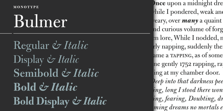
BULMER bulmer Bulmer

If reading or looking close, I cant really tell
much different between the two. I cant get bulmer in my list of fonts so could
only use a picture of it.
Maybe one
to overlap later down the line andlook into…..
many in the text picture above
looks different I guess….The m’s ascender looks longer and the y’s tail. Doubting (the word above) looks taller while in
italics, notice the b, and the i. Will test this out in my sketch book.
However, Baskerville really outdone itself by being only one of five
initial typeface choices available on the Apple IPad iBook’s reading devices in
April 2010.
Things for me to look into – Paper – uniform surface
and watermarks? Why were binding and marketing to consider?
Transitional typefaces
are a mix between Old Style and Modern typefaces.
Examples include Baskerville, Georgia, and Times
New Roman. The axis of symmetry is vertical as seen in the image below.

I used word to write this in baskerville old and copied onto blogger. I do hope this reads correct. I also looked at sources mainly from books and this site to double check my findings http://www.jquarter.org.uk/webdisk/morejbask.htm
I'm trying to read paragraphs and take notes, from the notes then trying to make sentences that I understand. To then write a report from notes, memory and visualising the story or text I've read. I feel this could help me find my own way of remembering and taking in information more efficiently.
I do tend to write lots of notes in artist talks but struggle to understand them once home. By practicing note writing I hope to get a better way of working to benefit myself.

No comments:
Post a Comment