Powered By Blogger

Wednesday, 12 October 2016

h/w cubism and related ism's

Cubism and related ism's.......

As I've done some looking into Cubism last year, I've decided to give a different look at influences that Cubism changed and how it brought a new way of viewing not only art but the work around us.

Paul Cezanne Father of Cubism

Paul Cézanne, 'Montagne Sainte Victoire' 1905-6

Here is Cezanne's watercolour painting Montagne Sainte Victoire 1905-6....In this painting he had wanted to create a solid look. While having the correct persective but from different viewpoints. On this picture its said that you can see it seems to be painted from different viewpoints so you can see, for example, two different views of a rock or a tree at once.

So Braque and Picasso I believe had seen Cezanne's work and had themselves be inspired by it. That along with changing technology, photography, impressionism, social changes, urban growth and of course the industial revolution.
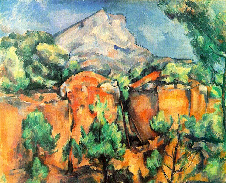
Cezanne's work

Image result for Houses at l'Estaque
braque's work

While George Braques work is more geometric you can see similarly between the two paintings. Shifting viewpoints, brushwork, tonal value. light etc..

Picasso who took a different approach but with similar outcome was also heading and beginning to thinking about different perspectives and the psyche of the mind. After a visit to a museum in 1907,  he was have said he particularly liked the sculptures from Africa and from French Polynesia describing them as ‘the most powerful and most beautiful things the human imagination has ever produced’.   His work with the African Masks is a good example

Pablo Picasso, 'Bust of a Woman' 1909
picasso's work

Pictorial space and perspective started to play in the thinking and make-up behind artwork. The real world then started to appear in the style of synthetic cubism.

Juan Gris, 'The Sunblind' 1914
Juan GrisThe Sunblind 1914

 Colour and tone led to the collage....

Pablo Picasso, 'Bottle of Vieux Marc, Glass, Guitar and Newspaper' 1913
Pablo PicassoBottle of Vieux Marc, Glass, Guitar and Newspaper 1913

Image result for braque synthetic cubism paintings
The Bottle of Banyuls - Juan Gri

Making things flat look 3 dimensional. Using mediums or items like frottage, newspaper, cain and wicker.

Juan Gris - known as the third cubist.  Gris is said to have idolized Picasso. Below is a portrait of Picasso in the cubist style by Gris.

Image result for Portrait of Picasso (1912)
Portrait of Picasso (1912)

I do like the college/synthetic works of Gris because I like the way he depicts out the patterns of the wood or marble (for instance). I have myself an interest in making representational work of an original object or item.

After the flat collage came sculpture based collage....aka the 2d surface of a painter is extended to college + 3d form of sculpture extended = an environment! 

Kurt Schwitters - was a German artist who was born in Hanover, Germany. Schwitters worked in several genres and media, including Dadaism, Constructivism, Surrealism, poetry, sound, painting, sculpture, graphic design, typography, and what came to be known as installation art.

Image result for Merz Pictures

Image result for kurt schwitters merzbau

Merzbau is a vast architectural/sculptural project of the poet and visual artist Kurt Schwitters (1887 - 1948). Schwitters himself has described it as his life's work. The construction was first begun in Hannover, Germany (sometime between 1919 - 1923). Because of war he fled to  Norway and here began a second Merzbau. When the Nazi's invaded Norway in 1940, he was forced once more to flee.

London then Ambleside in the Lake District.


Schwitters' built his constructions into his residences incorporating rooms he lived in into the structure. The ceilings and walls were covered with three dimensional shapes and countless nooks and grottos were filed with a variety of objects -- "spoils and relics" (personal items Schwitters stole from friends and acquaintances). These nooks and grottos were sometimes obliterated by future additions, leaving them existing only in the memories of the earlier versions of the work. Schwitters considered the Merzbau on principle, an uncompleted work that by it's very nature, continued to grow and change constantly.


Image result for kurt schwitters ambleside merz
merz barn
Image result for kurt schwitters ambleside merz
Reconstruction of inside of barn

Herni Matisse  


 Although Matisse rejected Cubism, he certainly felt challenged by it, and this picture - along with many he painted from 1913 to 1917 - seems to be influenced by the style cubism, since it is very unlike his previous, more decorative work.

Image result for Bathers by a River (1917) Artist: Henri Matisse


With all these changes in art and the theory behind what was considered art could only led the way for more mixed media works and the environmentalist artist...........


HAVE YOU NOTICED HOW JUST RESEARCHING IS LEADING ME OFF ONTO OTHER MOVEMENTS?  THIS IS HOW CLOSELY CONNECTED THEY CAN BE AT TIMES!

Dadaist and Surrealist promoted the fact that any object could be art in it own right!

I would have and did turn my nose up at the story of Marcel Duchamp Fountain...The same way I had when viewing Braque's cubism images! Or the weird world of surrealism....xpressionism now I did like that because it was colourful, pretty and most of the time made sense when viewing.

Image result for marcel duchamp fountain
fountain
Image result for marcel duchamp readymades
also known as readymades
       

Is a work of art merely a work of art by exhibiting it?

This is a theory that I myself tested out at our college exhibition for the show creative coat hanger....

WHY?

Firstly I have noticed just how much I like things to be nice, neat and controlled.......My childrens artwork when growing up, well I controlled it....if it didn't look right or if they had something the wrong way up or that I thought looked better differently I would change it....... controlling everything!

Criticism or reaction..... Who cares what people think ? RIGHT wrong!


So here I was after watching a documentary about bob (cant mind his last name)


Cleaning the dirty windows of the exhibition planing on keeping the dirty water, bucket, tissues and cloth as a display/enviromental item! I also left one window dirty in its current state! ? Why ?? I dont really know it just felt like I wanted to push my own personal boundaries......(that I set up many years ago without knowing)  I had no reasoning behind it other than letting go and opening myself up for argument or debate... I felt my work wasnt good enough maybe? disconnectioned?

I remember when watching bob lose himself in song or whatever, I remember wishing I could to just let go of caring and be as free as him......to actually shout or dance or do just whatever came out of me at that moment in time....to express me.......

If I had sculptured a bucket and had made my own paper to look like the cleaning kitchen roll I'd used! Would my display be accepted and considered art? (probably) but I still had an active roll in producing the final outcome.....I choose how my tissues sat next to one another.....The dirt and dust around it.....The dirty water with the sediment settled on the bottom of the bucket....settled because I let it and I helped bring it together....Like an artist mixes pigment......Well kind of haha but you get the just!

I put A SIGN next to it asking is it art....... Somebody wrote NO ITS A MESS

Now once over I would of agreed and may of even been upset by the comment. Taking it as a personal attack....But it was my intention to get a reaction and I did......But the winner here is the fact that 1....I got that person to think....or not but to engage atleast........
2....I found a few ways of looking at the reasoning behind artwork or displays
3....I opened myself to criticism
4.....I felt a connection to other artists as an artist's way of doing

WHO CARES IF IT WAS A PILE OF SHITE....for me it marked a viewpoint of a different way of thinking or seeing. Just like cubism had inspired many others and led onto other movements like futurism, dada, surrealism etc

Wether you like cubism or you dont it has influenced many people, movements and styles...


Wednesday, 5 October 2016

watercolour....EERIE vs SOFTY

Watercolour

For our brief A Painters Eye we were to explore and investigate the physical properties of different media and materials.

In my sketch book I was looking to see it you can ground an object (in this case a man) by use of watercolour.

This got me thinking about the characteristics of the medium! Its transparency and highlighting qualities. While this works well for a soft approach on things like pretty landscapes, idyllic cottages, flowers, or even quick colour washers on architectural drawings.

Watercolor Study of a Brown Hare, Albrecht Durer
Albrecht Durer, Hare, 1502
"Birch at Hart Lake" - Watercolor
Zoltan Szabo

Richard Parkes Bonington ‘Verona, Piazza dell’Erbe’, c.1826–7
Richard Parkes Bonington
Verona, Piazza dell’Erbe c.1826–7

Joseph Mallord William Turner, 'The Blue Rigi, Sunrise' 1842
Joseph Mallord William TurnerThe Blue Rigi, Sunrise 1842
Sargent: Santa Maria Della Salute
John Singer Sargent

While Sargent was known for his oil painting he did use watercolour on his travels. The above painting is my favorite example of watercolour thus far.

 Does it work on a darker more intense scene?

Scenes of War or Asylums is what I was thinking!


Add captionWatercolour of Inkermann by Lt the Hon H.H. Clifford VC


La Phare de Calais: Eglise du Courgrain-Maritime
Thomas Hennell
Rue d'Allent, St Omer; Celebrations and Sewer mending
Thomas Hennell
Thomas Hennell watercolours I feel really give a great example of how watercolour works. The vibrant colours, illuminating properties and fluidity that the artist has created is truly brilliant. However, while a war scene I still feel that watercolour is too child like. Many of these watercolours I have looked at are 18th century so that may have been the in theme at the time. Hennell himself was a war artist so I guess this medium was easy to transport, mix and use quickly at the time.

Capture of the Maria Di Giovanna, January 1941
Loading an English Carrier, and the French Cruiser 'Gloire' at Algiers, 1940
Loading an English Carrier and the French Cruiser ‘Gloire’ at Algiers, 1940 Roland Vivian Pitchforth


Image result for poynter santa maria
poynter Santa Maria della salute, watercolour

 Notice the darkness in tones between the two scenes here (above and below)

Joseph Mallord William Turner ‘Venice: Santa Maria della Salute, Night Scene with Rockets’, c.1840
Venice: Santa Maria della Salute, Night Scene with Rockets, Watercolour and bodycolour on paper

Joseph Mallord William Turner's work above for me was the closest to a dark eerie nighttime scene. I do like how the image has depth and the detail is still there, taking your into the picture, The flash of the rocket takes your eye up and the boat in the foreground also holds your interest. Thinking of the composition I feel it works really well, as it has you involved and intrigued by what is going on in the scene. However he only got this affect from using bodycolour/ gouache along with watercolour.

Image result for charles a hamont doyle meditation watercolour
Charles Altamont Doyle, made after epilepsy and alcholism had forced Charles Doyle's incarceration in 'Sunnyside', as he ironically named the Montrose Royal Lunatic Asylum.


Image result for edmund dulac watercolour
Edmund Dulac The Entomologist Dream

Above the image by Edmund Dulac while dark, gives a sense of a story book illustration rather than a true horror of the story when read alone without imagery. It works as intended...a story book illustration but if used in a different medium I do wonder if the outcome would of been different!

This work is an illustration for Le Papillon Rouge (the red butterfly) by Gerard d’Houville, a tragic love story published in the Christmas 1909 edition of the French news and art magazine L’Illustration. The tale explores the supernatural potential of dreams and the hallucinatory power of a moonlit night. An entomologist is driven mad by his failure to meet the demands of his lady for a blood red butterfly. After a lifetime of searching he ransacks his entire butterfly collection in the throes of nightime delirium. The insects magically awaken and fly from their cases into the night. The entomologist is found dead in the morning, heartbroken.
Source from http://collections.vam.ac.uk and https://www.gov.uk/guidance/ministry-of-defence-art-collection

So with all this I guess watercolour isn't a strong media for dark eerie images or portraits.

Sunday, 25 September 2016

H/w Goya

Francisco Goya


As part of our Printmaking Homework I was asked to look at the prints of the artist Goya.

 The prints of the plates that are displayed below were published in 1864 (first publishment) and are part of the collection of Museo Nacional del Prado museum of the .....Los disparates (The Follies) collection.  These were the prints I decided to view.

 El caballo raptor (Kidnapping horse) 

  This is a great example of tone. Look at the way the light is reflected in the background and foreground.  The detail is impressive and I never knew as much detail could be achieved in an etching.  Looking at the contouring of the horse and fabric of the man you can see a understanding of form. What does work I think is the way he over exaggerates the angles of the bodies. (horses neck etc)   I actually feel like saying I Love It. If you close your eyes the light area really do jump out for you. This creates an expressive sense and adds to the dark reality of the overall scene.
 
Νο. 10: El caballo raptor (Kidnapping horse), 24,4 x 35,3 cm. (platemark)/33,7 x 50,2 cm. (sheet)

Νο. 2: Disparate de miedo (Fearful folly), 24,4 x 35,3 cm. (platemark)/33,7 x 50,2 cm. (sheet)

 Disparate de miedo (Fearful folly)

Again another scene that provokes fear and drama (A dream like state almost surrealism style). To think these scenes were a dig at the political world of what was happening in Spain at the time makes you question WHAT DID PEOPLE BELIEVE OR FEAR AT THE TIME? You can feel it......Near the tree in the middle section adds another image that could go unnoticed....alot happening here! Different scratching techniques used or overlaying adding depth and shade

Νο. 4: Bobalicón (Simpleton's folly), 24,3 x 35,2 cm. (platemark)/33,7 x 50,2 cm. (sheet)
Bobalicón (Simpleton's folly)

This one makes me smile a little at the word simpleton!  Can you even use this word to describe someone nowadays? It expresses the simple look (mental health) in the giants face and the unknown fear of the situation in the man cowering behind the cloak......The figure behind adds a different sense of ghostly fear.. again the mark making is in-creditable and the tonal value.   I do wonder if the scenes are suppose to be night-time scenes of it this was the only way of working at this time? Or to achieve a dark, gloomy effect!

Νο. 9: Disparate general (General folly), 24,1 x 35,1 cm. (platemark)/33,7 x 50,2 cm. (sheet)

Νο. 11: Disparate pobre (Poor folly), 24,4 x 35,2 cm. (platemark)/33,7 x 50,2 cm. (sheet)
The works seem to me 'slightly schizophrenic' or some kind of mental health confusion among them.

merry folly
Image result for goya screen prints

Look at the detail in the hind-leg of the bull.  The merry dancers on the above print. The tones and the way the dark background makes the images jump out almost dancing around the the print. The light reflecting is bold and exaggerated again. The build up and processes must of taken a lot of time and planning. I'm sure a lot of experimenting must of taken place in the years before Goya finished these works. I'm jealous of the dedication artist's seem to have in any work.


Some facts I looked at to get a better understanding of some of the terminology of the printing processes. I will try and create some examples of these in my workbook..... like wax etching or lino cutting... printing on the press or mark marking with different tools and mediums....  

This artist reminded me of the etching Picasso had produced years later and that I had looked at last year. The surrealist style. In all the similarities of the power being produced from having no colour. Just line tone and form.
Image result for picasso etching
Picasso - Miotaur etching
Engraving 

In engraving, the grooves which will hold the ink are cut into the copper or steel plate with a burin, a sharp-pointed steel rod set into a handle. The burin cuts a triangular furrow in the plate, cleanly removing a thin strip of metal. The engraver holds the steel rod between thumb and forefinger, pushing the burin with the heel of the hand and altering the direction of the lines by manipulating the plate with the other hand
Considerable effort is required to drive the burin through the metal, and this physical force is reflected in the lines of the engraving, which can be made to swell or taper by varying the pressure on the burin. In addition to the varying strength of the lines, intricate systems of cross-hatching are used for modeling and shading. The engraver may also use the burin to achieve a variety of textures through combinations of dots, tapering cuts, and the like, but the effect is characteristically one of precision and organization rather than spontaneity. The crisp elegance and clarity of the orderly lines are among the particular beauties of engraving.


Dry-point

The soft, feathery lines of drypoint lend themselves to playful illustrations or expressive sketches, which can then produce an edition of prints. Traditionally dry-point is done on copper plates with a diamond- or carbide-tipped needle. It is then inked (as in all intaglio methods) and cleaned, leaving ink only in the crevices. The force of the printing press then squeezes out the remaining ink and the image is transferred onto the paper – this requires tremendous pressure that cannot be applied by hand (hence the necessity of a press).

Etching 

In etching, the grooves which will hold the ink are bitten with acid, rather than cut with a tool. The etcher warms a clean, highly polished metal plate [usually copper or zinc] and covers it thinly with an acid-resistant "ground" [composed of asphalt, resins, and wax] using a roller or dabber. The artist draws in the waxy ground with a smooth point or needle that scratches it away, exposing bare metal. When the plate is submerged in a pan of dilute acid, the acid bites into the exposed areas, forming U-shaped grooves.

Several methods exist to create lines of varying strengths. The breadth of the point of the etching needle affects the width of the line, as does the biting time. Perhaps the most common method of controlling the strength of the lines is by "stopping out." The whole composition is drawn at once. The plate is bitten for a certain period of time, then varnish is painted over the lines which are to be light, to stop further biting, and the plate is returned to the acid. Successive biting and stopping out continue until the lines which are to be darkest are bitten to the desired depth.


Aquatint 

Aguatint was first widely used in the eighteenth century to imitate drawings done with brush and wash. The technique enables the artist to achieve areas of graduated tones, broader and more even than is possible with etched or engraved cross-hatching.

Traditionally, a powdered resin is dusted onto a clean plate and made to adhere by heating the plate, so that the tiny droplets of melted resin form a permeable coating. In another method, the plate is coated with resin dissolved in alcohol, which evaporates, leaving the resin grains evenly distributed on the plate

Saturday, 24 September 2016

Impressionism


Impressed you should be......
Portrait of Pierre-Auguste Renoir
Renoir

A 19th century art movement that came about in Paris between 1870's - 1880's. First of all the term impressionist was used as a insult to the artists who first exhibited they work. This was rejected by the art establishment. The paintings were considered among the first works of art in the modern era, due to the rough painting style and absence of idealism in the figures.  Impressionism painters such as Claude Monet, Edgar Degas, Manet and Pierre-Auguste Renoir were said to be some of the first style of impressionist painters.

  How  they work could be rejected is beyond me, but I guess the bold colours and fast brush strokes were a little different for the time and theme of the old style renaissance paintings.


Fixed size image
Renoir

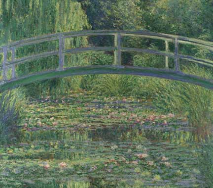
Monet, 'The Water-Lily Pond', 1899
Monet the water lily pond
Seeing some of these artist's work in a modern day museum you can't believe a world could exist without such wonders and I guess that why they came under negative scrutiny.  

I remember viewing a Monet and being left emotional for no other reason than the colours made such an impact on something inside me. Maybe the way the light gave way in its changing qualities....even thinking of the way it made me feel brings tears to my eye this very day. It left an impression I guess you could say.....

Modern Life

The artist's also began to focus on the everyday people or as called in the day folks. Scenes of the working middle classes and peasants were a interesting subject to the impressionists.

Renoir, 'At the Theatre (La Première Sortie)', 1876-7
Renoir, At the Theatre (La Première Sortie)

Detail from Monet, 'Bathers at La Grenouillère', 1869
Monet the Bathers
The way the mind can make a image of what they think they see in a couple of strokes played an interest and part of this style. To stand back and look!  The colour wheel started to play out also... Colours that when next to each other could intensify one other. Complementary pairs for painters are red/green, yellow/violet, and blue/orange.  This started to change the way of painting forever.


The people (middle classes/working folk) became the tragic, and occasionally heroic, focus of serious literary works. Novelists took as much pleasure in describing the cafés, bars and theaters of Paris as the artists did in painting them. More descriptive..... they’re concerned with the “emotional landscape” of the setting.  They’re interested in the ways the setting evokes certain emotional responses from both the characters and the reader. 

Most famous author being Joseph Conrad, James Joyce, and Henry James.


Image result for james joyce impressionist poems  Image result for james joyce impressionist poems

 Employing details in such a way that it’s sometimes difficult to see a clear picture of events if you focus on the details too closely.  Much like an impressionistic painting, it’s only possible to get a full picture once you stand back from the novel and view it in its entirety.

Image result for james joyce impressionist poems
this I liked  and i still sense not that much has changed


Image result for first tubes of paint in 1880      Image result for first tubes of paint in 1880


Another factor which changed how artists painted was the innovation of ready-made paint in tubes. Grinding pigments in order to make up oil paint had been a laborious and untidy process. The availability of a wide range of ready-made colours meant that artists could work outdoors, rather than in a studio. They could also work at much greater speed, at moments applying the paint straight from the tube without even using a brush.


Lets go outside......